


If you work in the subscription business one of your biggest aims is no doubt to improve customer conversion. At Bespoke Post, following conversations with others in the subscription business who’re nailing it, we’ve been taking steps to achieve this, as well as boost LTV.
We’ve found adding certain steps to the checkout flow can have a big impact on both conversion and LTV, and here I’ll explain what they are and the results we’ve achieved over the past few years.
I'm from Bespoke Post, for those of you reading who haven't heard about us, we're a subscription e-commerce site for guys.
About Bespoke Post
I know that's not too descriptive so to give you a little more detail basically we have our buyers go out and try to find the coolest products out there and create these themed experiences. What we actually call it is a box of awesome kind of tongue in cheek.
I like to say that our goal is to turn our members into the most interesting men in the world, one box at a time.
What's in a box of awesome? A couple of things: a drink, outdoor apparel, food, grooming, throwing knives. I don't know what category that fits into but it was a fun day of product testing at the office.
All boxes are $45 and ours is an opt-out model, which is just important for context. We don't automatically send you something each month, on the first of the month we tell you, "This is the box you're going to get and you have five days to opt-out or not".
That's the end of the sales pitch but that was all important context for what I'm about to talk about. What I'm talking about is improving conversion and LTV by adding stuff to check out.
A quick story
I'm gonna begin with a quick story. I was having coffee with another subscription box company.
I often like to knowledge share with other companies, my team knows this. It is the most valuable thing I do so if you take one thing away from this article, I really urge you to do that.
Anyway, we were talking and mostly we were talking about this guy…

...not Mark specifically, but Facebook as a whole because Facebook is what a lot of us DTC and subscription brands have been built on the backs of when they figured out how to do effective targeting to their massive audience.
As a quick side note, we were advertising on Facebook before it actually worked well, I'm talking back late 2012, I was advertising on Facebook, and it just wasn't working. There was a specific announcement and launch 'lookalike audiences'.
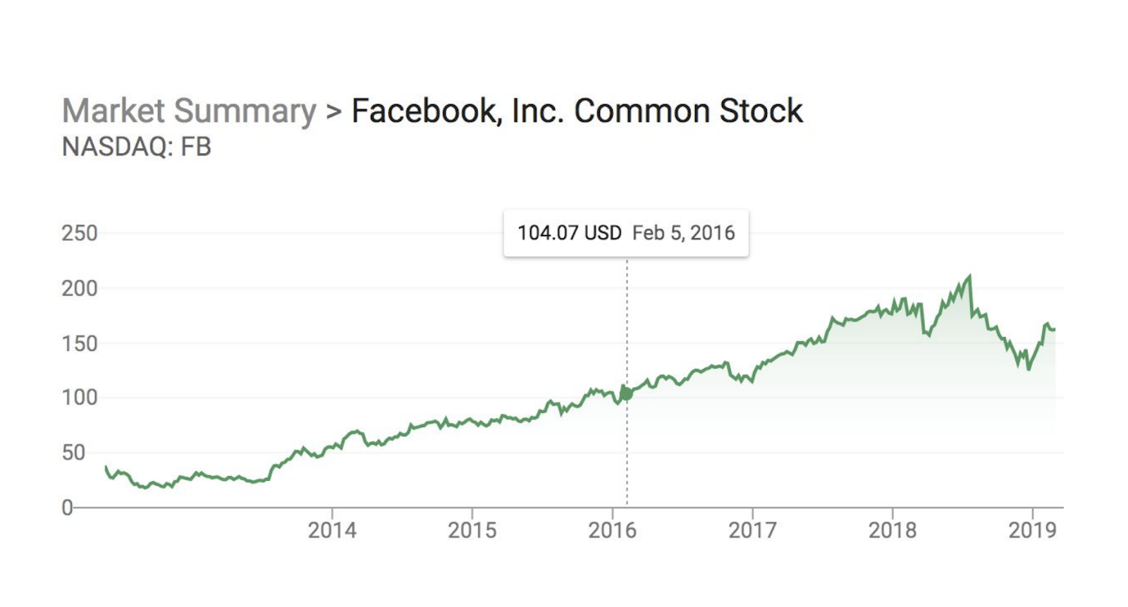
That was a massive turning point for I think many brands out there, including ours and we just started spending efficiently and growing really quickly. I remember turning to the co-founders and literally saying, we have to buy Facebook stock now.
Back to our coffee conversation. One thing that we weren't quite doing as effectively as other brands is we weren't able to scale our spend as much because our spending wasn't as efficient.
So we were talking about this subscription brand and they were scaling much faster than us so I was asking him, why could this be? So, "What are your CPMs?" and he shared them with me, I said, "Okay, those are similar. What are your click-through rates?" He shared them with me and I was like, "Okay, ours are actually better than that. How about your conversion rates?" and he told me, I did this.

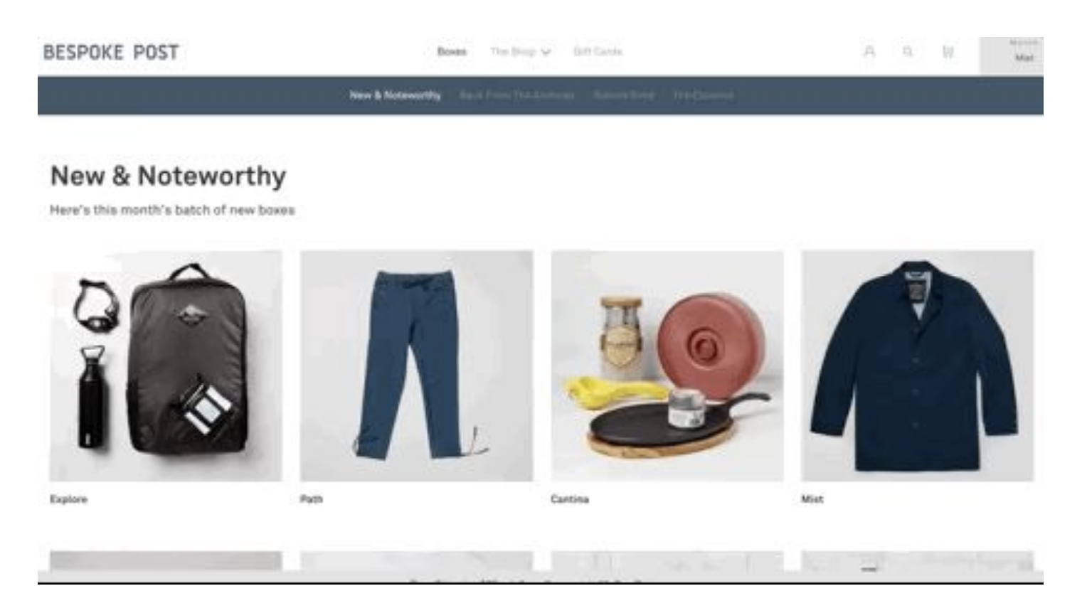
We had tried creating custom landing pages before, but they weren't that effective. So we ended up just sending traffic to our homepage and we kind of defaulted for that until that conversation.
Just to give you an idea of what the homepage looked like back then, we used to be a gated site where we forced email capture, and once you got through, and actually gave us your email address, you'd come to our homepage, not a specific landing page.
We were fine with that until I had this conversation and I literally rushed back to the office and said, "Hey, the reason why I'm not able to spend your money efficiently co-founders is because our conversion rate is horrible". So we decided right then and there we were going to make a wholesale change, not to the homepage, but to the landing destination.
Three changes to remove friction
We decided to make three massive changes all with the goal of removing friction.
Streamlining page to focus on subscription offering
First, before we had on the homepage three basic levels of navigation. So you'd land on the homepage, we talked about the club but then we'd have boxes where you could go and see all our available boxes, and product pages, you can click into those boxes and you could buy a one-off.
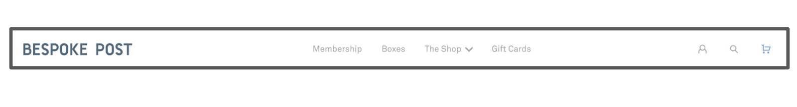
Then we had the shop, we have an e-commerce store, eight categories, hundreds and hundreds of amazing products, because our buyers are awesome. And then gift cards, so you come to the site, maybe it's uncle Charlie's birthday next week, and you go down the gift card route and you're not focused on the conversion.
We decided in this new landing page, we're going to do this…
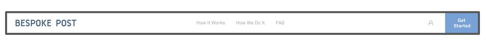
Solely focused on subscription, how it works, how the subscription works, pricing, how subscriptions are priced, FAQ about the subscription program.
Removing our available boxes
Secondly, we didn't let people look at the available boxes on site. We have lots of boxes, they're all really cool and you could previously go down and even buy them one-off.
On the new site landing page, we removed that.
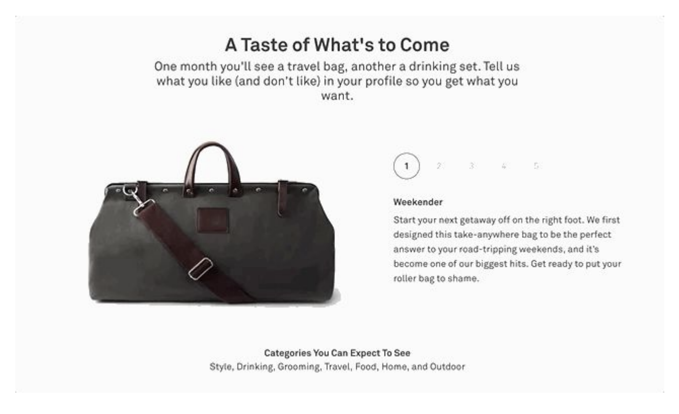
We gave you a taste of the boxes, we showed you the name, a quick description, you couldn't click into it, the only way to get access to the boxes that were available in the moment was by signing up.
Removal of upfront charging
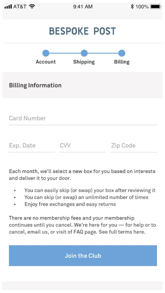
Last but not least, we stopped charging upfront. We used to charge $45 no matter if you're getting a box right off the bat and that cost goes towards your first box whenever you'd get it.
But obviously that was a bit of a hurdle so removing that allowed us to say this on the site.

People love the word free.
The result?
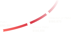
Those three changes together, allowed us to do this.
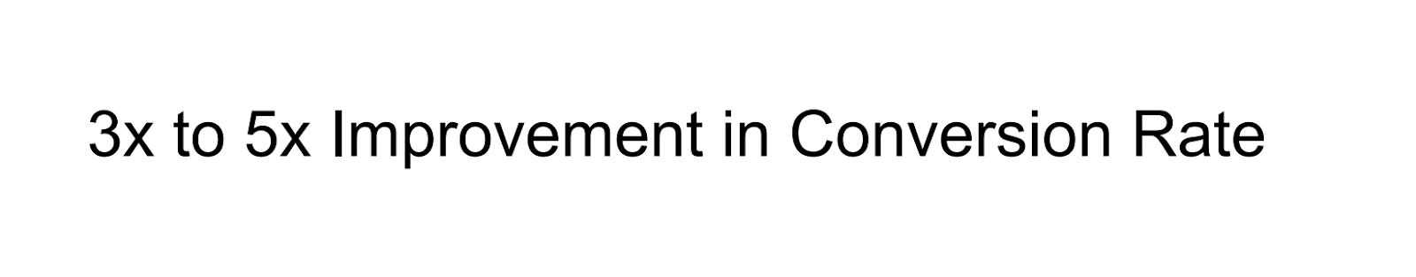
Massive.
Now, grain of salt because our conversion rates sucked before - pardon my French, but it was massive, and I actually took a video from when we first saw the first results come in which you can see below.


This is me and the co-founders looking at those results. But in looking at the results, we also saw the LTV of a subscriber dropped.
It makes sense because we went from making our subscribers run the equivalent of like a tough mudder to subscribe…

...to basically saying this...
We did the math, and obviously a 400% improvement in conversion, a 20% drop in purchase rate, we'll take it.
Back to the coffee chat
Getting back to the topic of today, let's get back to the coffee chat. We were talking about conversion rates, at this point we probably moved to the bar and started having some beers, and we talked about each other's checkout flows. We're a hit at parties.
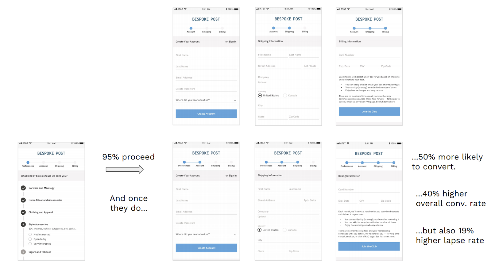
Checkout flows
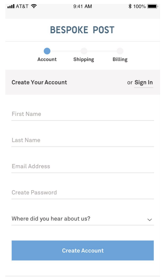
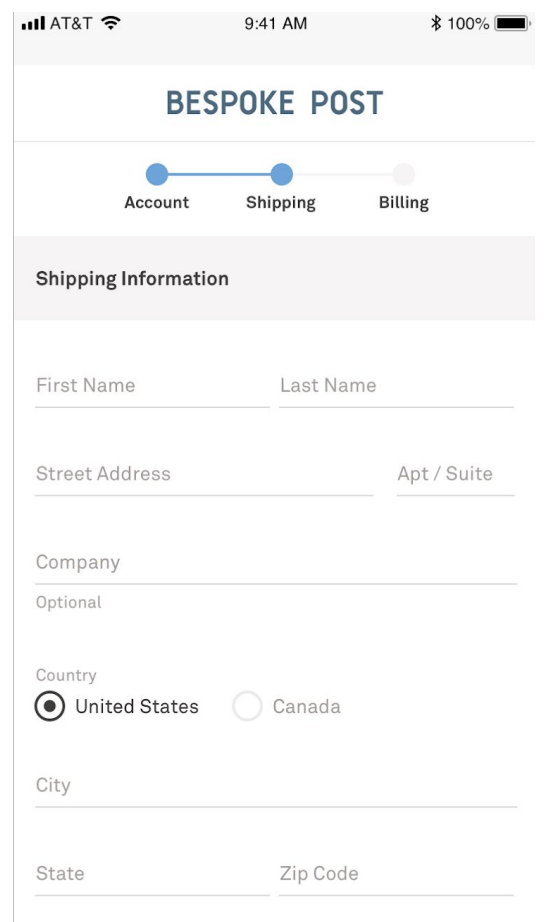
We were talking about checkout flows and our checkout is pretty standard or was pretty standard. You've got your account, you've got your shipping, you've got your billing.
One thing that our friends over at Bombfell do, and many clothing subscription companies do this, is this is their first step of checkout is a full questionnaire asking about sizing which is obviously very relevant information for them.
But what they are doing a little differently and what other clothing subscription companies figured out, is they don't wait for you to sign up to do this, they actually did it earlier on. We had something similar but it was kind of buried in our account page, and we asked different questions.
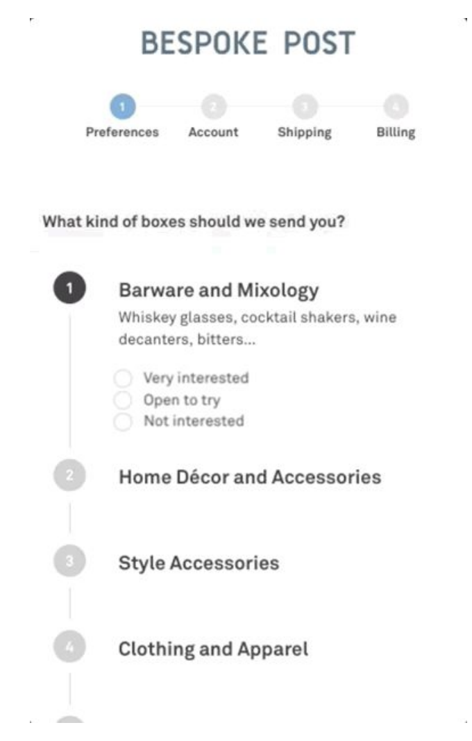
So from this conversation, I decided to change the questions or bring it up a little bit, but still after checkout, but that was still a little buried. So checkout flowed as it was then account > shipping > billing, and then after conversion, we had the questionnaire.
Introduce friction
We said, "Okay, let's introduce a little friction to the equation and take a little page out of the playbook of our clothing subscription brother and sisters and just flip it”. We did a little test and we flipped it and we put this questionnaire - 10 questions asking you how interested you are in different product categories.
The result?
An actual increase in conversion rate of 40%. This was me.

But again, another metric went down, we saw a 20% decrease in lapse rate, because you're capturing all these people who are just intrigued by the questionnaire and thought, "This is kind of cool I just want to see this through".
Again, we did the math, and it worked out.
Lapse rate
This was only our first iteration and we thought okay we like the current conversion rate improvement, what can we do for this lapse rate? How can we improve that?
We looked at another brand that does this really well, Care/of, for those of you that are familiar with it, their questionnaire is amazing. It's fun, it's interactive, you feel like you're actually talking to someone. They make great use of animations and emoticons and it's really long - they say only about five minutes but I think it can take longer than that.
They seemed to be on to something so we thought, what can we do with our questionnaire?
We had one page that had 10 questions on the same page and decided to make a little minor change and let's turn that into a 15+ page questionnaire that had even more questions than we had originally.
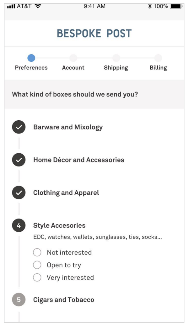
If you told us you like clothing apparel we ask you all the sizing questions, if you told us you were interested in cigars, tobacco, alcohol products, we ask you your age.
We were doing this with the intention of hoping hopefully improving lapse rates, which we did, actually a nice bump of 13.5%. However, what surprised us is we saw another six and a half percent improvement in conversion rates.
Not all good news
But it hadn't been all good news throughout.
I've been taking you on a three-year journey, but we realized after a while that we were getting really good at funnelling people to check out so actually our funnel completion rates were dropping over time, the overall conversion rate was pretty steady, but our funnel completion rates were dropping over time.
So again, we're thinking how can we experiment with this idea of friction? Because every time we'd added friction, after some iterations, we had seen positive results. So what we've done kind of recently, we still have our 15 question + questionnaire and we decided to add an intro screen.
Add context
We were seeing a lot of people were just getting to the site, clicking on 'get started' and had no context, so this allowed us to give a little context. Here's an image, it has the type of products you might use, it has a box in it, so at least if you don't even know we're a subscription company you may be like, "Oh, they're a subscription company".
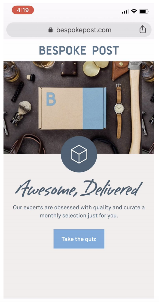
We also tell you you're about to take a quiz, which before we didn't always do. So some context there.
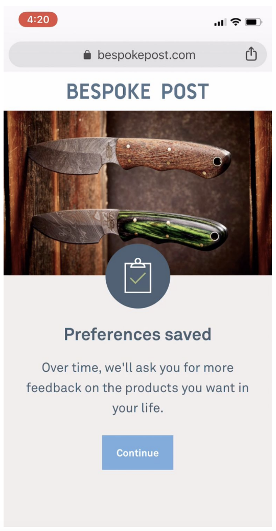
Relationship building
Then we found an excuse to put a cool image of knives in our checkout flow. But more importantly, we also had the message of 'preferences saved' - relationship building, "Look, we're storing these things you told us about, and we're going to use it. Not only that but we're going to ask you more things over time, and use that as well".
The results
We actually saw a 3% decrease in conversion rate, apparently, you can't infinitely add stuff to your checkout flow and see conversions go up, shocker. But we saw a slight increase in lapse rate.
At this point, we're thinking that's a wash. But then, we saw this 11% increase in purchase rates of the initial first box assignment. We were actually not expecting that and so something about these new steps is helping purchase rates.
Do you think it really stopped there? No, we're trying reviews right now - so far not working. We'll keep trying, there are other parts we can play with, we know we'll make it work.
The value of data
Also, last but not least, the biggest boon to lifetime value, which I've held to now is actually having the data from this questionnaire, because we launched 15 to 20 new boxes a month.
Now we have to assign those to our subscribers so knowing what everyone's interested in has helped purchase rates steadily climb over time, even as we're expanding our spend and getting a less valuable customer in there, purchase rates have stayed up.
Also, the more we know about you, the better the box we assign you, the more likely you're going to stay with us. Also, it's a great diagnostic tool.
In the last year, we were seeing our lapse rates slowly creep up and we had no idea why. We pulled the numbers from our survey and eople who said they're interested in camping outdoors, and music and tech and gear, we're steadily increasing. We had no idea that was happening and part of the reason comes back to Facebook again because, on Facebook, we were running ads that had camping and outdoors and tech gear.
So we were attracting a certain type of consumer coming to our page and the mix of our subscriber base was changing. But the problem was, when you signed up, we don't have good boxes, or didn't have good boxes upon sign up for these people.
They've come to the site to sign up, not got the payoff from the ad they saw back on Facebook or Instagram or on the web and thought, "Oh, not for me" and canceled. So now we're talking to the buying team and they're making sure we have outdoors and music and tech gear boxes ready for a new subscriber.
Yay, data.
Summary
So the TL DL, friction can be good and bad.
We found that removing friction from our landing page and getting people to check out is good. But adding friction into the checkout with the right type of friction is very good.
Take a big picture view of your metrics
If we'd only been seeing and talking about conversion rates the whole time, we would have been missing the fact that lapse rates were plummeting after some changes, that purchase rates are going down, so look at the whole picture.
It takes time
Yeah, this looks great, that was three years. There was a year in there we didn't touch check out or landing page. There were millions of iterations on things that didn't work. Remember, we weren't even doing a landing page for a while because we thought the homepage would work better.
Promote a testing culture
We've always been a testing culture, which is great because you can keep plugging away and finding stuff.
One solution does not fit all
This will not necessarily work for you guys putting knives in your checkout will probably not work for you. But you have to find what does.
One solution won't fix all
Any solution we implemented had positive effects in one place, negative effects in another. So it's the combination of ideas that can get you to the end.
Things change, keep an eye on metrics, if we hadn't noticed that our completion rate had been going down over time, we would have kind of ignored it a bit, maybe not come back to some of the ideas towards the very end like preferences saved on the such.
Thank you.


Product marketing insider
Thank you for subscribing
Level up your product marketing career & network with product marketing experts.
An email has been successfully sent to confirm your subscription.
 Follow us on LinkedIn


.svg)
Start the conversation
Become a member of Product Marketing Alliance to start commenting.
Sign up now