


As product marketers, we obsess over small tweaks that can make or break user adoption – button copy, onboarding flows, call-to-action color choices. But what if the biggest lever we’re overlooking isn’t how we phrase the choice, but which option we silently make the default?
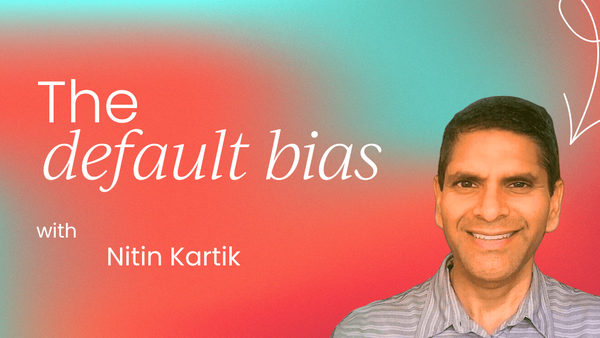
A new study published in the Journal of Marketing Research – “The Golden Halo of Defaults in Simple Choices” by Sullivan, Breslav, and Huettel – challenges long-held assumptions about how defaults work.
It doesn't just confirm the influence of defaults; it pinpoints how they exert that influence, when they fail, and why some defaults are far more effective than others.
I have unconsciously been using these strategies with many companies, and continue to use them as CEO at Caribou Strategic. Here I’ll break down what every product marketing leader needs to know – and how we can put these findings to work.
Key insight: defaults don’t work because they’re easy – they work because we perceive them as better
Most of us assume defaults work through laziness: users just stick with the preselected option to avoid effort. But Sullivan et al. found something deeper at play. Through a mix of eye-tracking studies, online experiments, and drift diffusion modeling, they discovered that defaults change how people perceive value.
The research team coined this phenomenon the “golden halo” effect. In short, assigning an option as the default subtly boosts its perceived value, even when there’s no difference in effort, no framing, and no rationale provided.
People don’t just accept the default – they like it more.
For product marketers, this unlocks a powerful new layer of influence. We’re not just guiding users toward action – we’re reshaping their preferences.
Application one: Design default states that align with user goals
One of the most surprising findings was that defaults only work when they align with the user’s existing goals. Defaults that conflicted with users’ motivations – like assigning a healthy snack as default to someone with a taste-first mindset – didn’t nudge behavior much.
Takeaway for PMMs:
- Don’t just push your desired outcome as the default.
- Match your default to the dominant user intent at that moment.
- If your user is exploration-driven, default to “Show me everything.” If they’re ROI-minded, default to “Quick wins first.”
Just because you can set something as the default doesn’t mean you should.
Application two: Use defaults to reframe preference, not just speed conversion
The traditional heuristic view said that defaults speed decisions by reducing cognitive load. But this research showed the opposite – defaults often led to longer decision times and more deliberate consideration.
Why? Because the default option is seen as a kind of recommendation. Users give it more attention, and in turn, more perceived value.
For PMMs, this means:
- Default = implicit endorsement.
- A default plan, feature, or filter isn’t just easier to choose – it’s seen as better.
- Want to push a bundled offer or high-retention feature? Make it the default.
But do so with care, because users are interpreting your default as a signal of what you think is best for them.
Application three: Don’t confuse visual prominence with default effect
One of the most practical implications of the study: the power of the default didn’t come from visual salience.
In a control test, when one option was highlighted visually but not called a default, it had no effect. Only when users were told something was pre-selected (even by an algorithm) did the golden halo emerge.
So for us:
- Highlighting a CTA isn’t the same as preselecting it.
- The copy “pre-selected for you” or “recommended” carries more psychological weight than bold fonts or colored buttons.
Smart product marketing = aligning visual design with implied endorsement.
Application four: Defaults are most effective in low-preference, high-ambiguity choices
The “halo” was strongest when users didn’t have a strong prior preference – essentially when they were unsure.
This aligns perfectly with what product marketers encounter in:
- Pricing tier selection
- Feature onboarding
- Registration opt-ins (e.g., “Subscribe to updates”)
So the next time you’re A/B testing default opt-ins or usage nudges, ask yourself: Where is the user undecided? That’s your high-leverage zone for default design.
Application five: Be careful with frictionless defaults – they might backfire
Another layer to the study: defaults that required zero action (e.g., pre-ticked checkboxes) weren’t always effective. When defaults were too easy to accept, especially when users had strong preferences, they triggered skepticism.
This is a valuable watch-out for PMMs working on:
- Subscription auto-renewals
- Cross-sell pop-ups
- Consent flows (like GDPR)
Users don’t like feeling tricked. The golden halo only works when users believe the default is a smart choice, not a sneaky one.
TL;DR for PMMs: When defaults work (and when they don’t)
The study identified four key conditions for effective default usage:
So, what should product marketers do next?
- Audit your product defaults: Where are you nudging without clarity? Are defaults working for or against user intent?
- Frame your defaults smartly: “We’ve preselected this based on your usage” will outperform “default.”
- Run behavior-focused tests: Instead of just measuring conversion, track satisfaction and retention for default vs. non-default users.
- Educate your stakeholders: Many designers and PMs still think defaults work by speeding things up. Share this research to shift that mindset.
- Make room for opt-outs: Empowered users convert and churn less. Defaults should guide, not force.
Final thought: Defaults aren’t passive. They’re persuasive.
If you’ve treated defaults as the lazy choice, it’s time to rethink. This research shows they’re a powerful tool for shaping perception, not just behavior.
As PMMs, we don’t need to trick users into compliance – we can guide them with confidence. And when we use defaults the right way, we’re not just optimizing UX. We’re building trust.


Product marketing insider
Thank you for subscribing
Level up your product marketing career & network with product marketing experts.
An email has been successfully sent to confirm your subscription.
 Follow us on LinkedIn


.svg)
Start the conversation
Become a member of Product Marketing Alliance to start commenting.
Sign up now