







The views expressed in this article are Alex Chahin’s own and do not necessarily reflect those of Uber or its affiliates.
Templates and frameworks to pair with this playbook
Nail the skills
Let’s start with a little experiment.
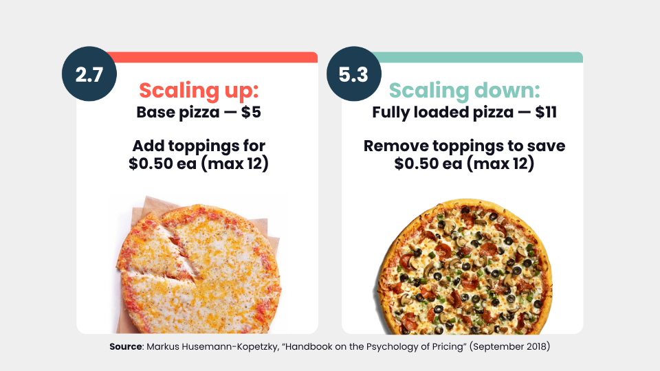
Imagine you've just walked into a pizzeria. There are gingham tablecloths, chili flakes on the table, the whole shebang. You’re interested in the build-your-own pizza deal where a plain cheese pizza costs $5, and you can add any of the following toppings for 50¢ each: pepperoni, sausage, mushrooms, bell peppers, extra cheese, onions, tomatoes, bacon, olives, chicken, ham, or pineapple.
How many did you pick? My guess is somewhere around two or three.
Here's where it gets interesting. When you flip that equation and offer a fully loaded pizza with all 12 toppings for $11, then let people remove toppings to save 50 cents each, the average fully loaded pizza ends up with an average of 5.3 toppings. The base pizza that was built up? 2.7 toppings.
Same pizza, same toppings, same pricing, and a 20% increase in revenue for the pizzeria. Nobody told you the chef trained in Naples. Nobody mentioned the locally sourced ingredients. All that changed was how the choice was structured.
That's what I want to talk about today.
As PMMs, we tend to spend a lot of energy agonizing over the perfect message. We look at what Apple does, we try to craft something equally beautiful, and we pour everything into the words.
But here's what I've found after reviewing 200+ briefs at Uber: we’re overlooking some powerful consumer psychology tactics. These tactics are backed by research and real-world practice, and they can help you grow faster. In this article, I'll walk you through nine of my favorites.
The idea I want to leave you with is what I call “mind-first marketing.” Design for the mind, not just the message. That's our refrain.
For expert insights like this, in full, every Friday, sign up for Pro+ membership.
You'll also get access to 30+ certifications, a complimentary Summit ticket every year, and 130+ product marketing templates.
So, what are you waiting for?
Designing the choice
Every purchase starts with a decision, and people rarely assess your product on its own. They compare it to alternatives and judge how the price is presented. Here are three tactics for shaping that context so the right choice feels like the easy one.
Tactic 1: Anchoring
Picture yourself on the merchandising team at Williams Sonoma, a home goods store specializing in cookware and appliances. Your job is to sell more bread makers. You've got one main SKU: a $279 bread maker. What do you do?
You might think about running a promo. Maybe some in-store signage explaining how great it is. Maybe a demo. All reasonable ideas.
Here's what Williams Sonoma did: they put a $429 bread maker right next to the $279 unit. Sales doubled.
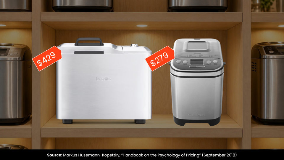
The $429 model wasn't there to sell; it was there to act as an anchor. The first piece of information you see shapes how you evaluate everything around it. Without that reference point, you might wonder whether $279 is a good deal for a bread maker you've never owned before. When you see it next to a $429 option, the math feels obvious.
You see this everywhere. For instance, Amazon uses strikethrough pricing to give you a reference point that makes the actual price feel like a win.
Tactic 2: The compromise effect
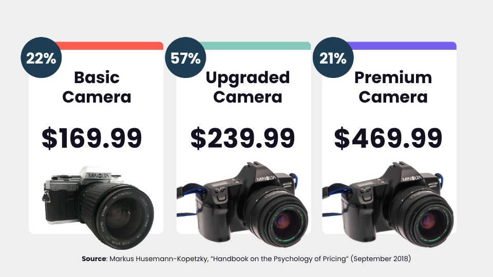
Now let's walk down the street to an electronics store. There are two cameras available: a basic one and an upgraded one. In that situation, purchases split pretty evenly between the two.
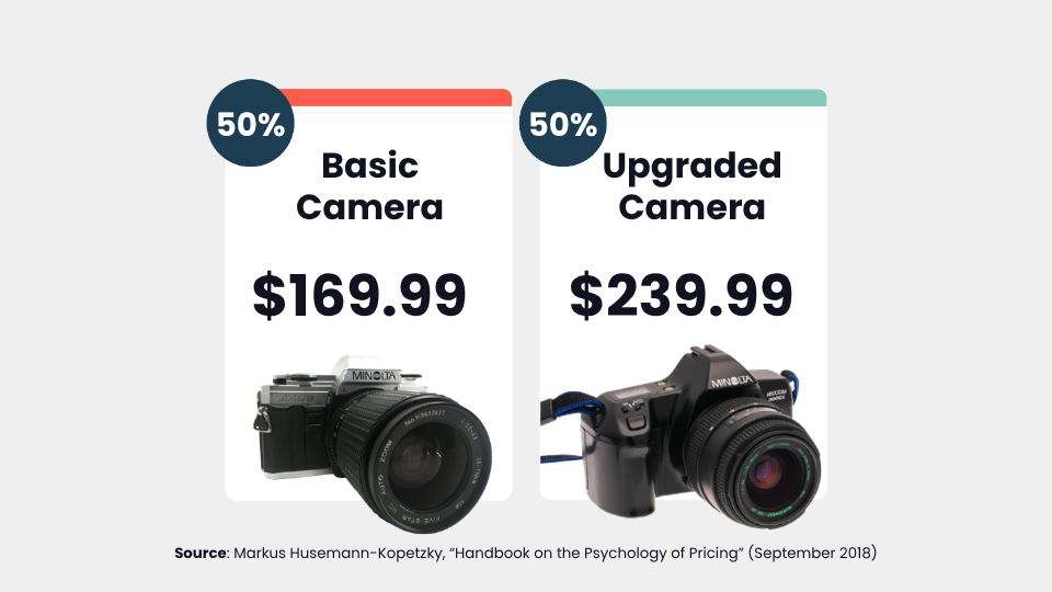
But what if you added a third camera to the lineup? Something more premium sitting above the upgraded option? Now 57% of people move toward that middle camera, and some buy the upgraded one too. That's a 33% increase in revenue just from adding a third option.
This is called the compromise effect. Products at the extremes tend not to get chosen. People gravitate toward the middle because it feels balanced. How a choice is presented shifts preferences, every time.
Tactic 3: Prospect theory
Let's move to online shopping. You're looking at a pair of headphones. On one site, they're $150. On another site, they're $145 with $5 shipping. You probably already feel a difference between those two, even though the total is the same.
This comes down to prospect theory. We feel losses more strongly than equivalent gains, and the more we lose, the less each extra dollar registers. Split that $150 into $145 and $5, and you trigger two separate pangs instead of one. The total hasn't changed, but it feels worse.
The practical lesson here is to group pains together. If you've got fees or costs you need to communicate, bundle them. Don't drip-feed them to your customers one at a time.
The flip side is equally useful. Separate your gains. If you find $10 on the street, that feels good. But finding $5 on two separate days actually feels better, even though it's the same amount.
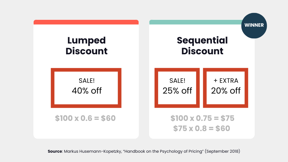
There's a study that shows this with discounts. A 40% off sale and a sequential "25% off, then an extra 20% off" promotion both net to the same price on a $100 item, but people prefer the sequential discount. More goodness spread out just feels better than the same amount lumped together.
A quick recap
Here's your action recap for designing the choice:


Product marketing insider
Thank you for subscribing
Level up your product marketing career & network with product marketing experts.
An email has been successfully sent to confirm your subscription.
 Follow us on LinkedIn


.svg)