


We all love using delightful products.
This enjoyable user experience comes at every part of the website, email communication, onboarding flows, and the product itself. While this rich user experience (UX) is usually crafted by the design team, product marketers will benefit from understanding which design elements can enhance the product experience.
At the end of the day, the role of product marketers is intersected with many other functions. So knowing how design can empower the user experience, showcase product value, and bring users to the “AHA moment” faster can become your PMM superpower. Creating a delightful UX is a huge topic.
I’m going to focus on one aspect of UX - animations in product marketing. Specifically, animation within:
- Different product functions,
- Value propositions,
- Go-to-Market,
- Product usage,
- Sales enablement, and
- Content.
Animation within different product functions
Animations in product marketing
Product marketing tells stories. We use words and visuals to spread our message into the world and make users feel, dream and desire. Animation is the special ingredient that elevates our story.
A company can only say so much through static content. So when static assets gain movement, they also gain a voice and translate stronger emotions, as well as simplify complex concepts for non-experts. Let's talk about a real story from my experience.
My journey with animations started in 2018. Back then I was leading marketing and product marketing at my startup, Flawless App. Together with my co-founder, Ahmed Sulaiman, we’ve been developing a new design tool, called Flawless Feedback. This tool helped designers to leave feedback on user interface (UI) elements, implemented by developers. Exactly like the name said.
It was an MVP with the main goal of testing our product-market fit hypothesis, which we formed based on users' insights. So we didn’t have much time to polish the design.
However, when you build the product for the design audience you simply cannot release a visually low-quality MVP. Designers will feel the pain of using something that looks ugly or doesn’t follow good UX practices.
We solved this puzzle by using lightweight animations, called Lottie, in our MVP that guided users around our product and playfully explained the product value. While those animations were super simple, they had the power to express why Flawless Feedback is useful right off the bat.
As a result, the response from the design community was very positive during our product-market fit testing. But the power of animations doesn’t stop here.
Animations in product experience
Product marketing benefits from using animations in several areas: emphasizing messaging, explaining value prop, and empowering the brand voice of your product.
Product management, on the other hand, benefits from the smooth product experience good animations can bring, making usage easier and retention higher. Those advantages are very interconnected with the PMM ones. So let’s talk a bit about UX and product pros of using motion:
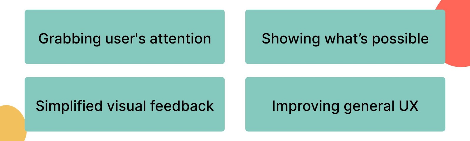
Grabbing the user's attention
With many distractions during the user journey, as well as interruptions in people's day-to-day life, it’s important to keep and direct attention. Animations lead the user's attention to the most important elements on the website, inside the onboarding, and email communication.
Using motion to show what’s possible
A great example of this use case will be guided onboardings when animations show which element of the product to focus on. It’s important not to overload users when they are just starting but it’s equally needed to showcase what is possible and how to interact with the UI.
Simplified visual feedback
Our brain is trained to recognize movement. So when the user completes the actions, the animation visually shows that something has changed. For example, when you complete a learning lesson or make a purchase, you can see a confetti animation.
It celebrates your achievement (part of the hooked model) and shows that the action was successful. Animations provide visual feedback, which is hard to ignore. It has the same effect when highlighting an action that has been unsuccessful. Failure can stop users from getting to the “AHA moment”. So it’s critical to highlight where it has happened.
Improving general UX
Well-thought animations can reduce cognitive load by simplifying a customer journey and guiding users to complete needed actions. A good product animation example here will be micro-interactions.
Those are ways for a device or app to highlight an action that a user needs to perform, give feedback on that action or make it delightful. Think of swiping gestures, pull to refresh, data input screen (password), current system status (‘your order is in process’), or toggle button. Or even an incoming call animation that you see every day. All those are tiny animations that make our experience a little bit better.
Animations in product marketing deliverables
I hope you enjoyed the short dive into the product design and product management world. Now we’ll get back to product marketing and discuss which types of animations can be useful for your product marketing deliverables. When it comes to creating an outstanding product experience, there are plenty of types of animation to utilize.
Animations can be clustered by purpose. For example, interactive animations, waiting (loading) animations, accent animations, and storytelling animations. They can also be categorized by the UI component type: interface element animation, product animations, and onboarding animations. For the sake of simplicity, I’ll cluster animations based on product marketing use cases:
- Showing value prop: ‘How it works’, features explanatory, branded animations.
- Launching products (GTMs): Announcements, landing page, email animations.
- Growing product usage: Onboarding, awards, gamification, and error animations.
- Creating sales enablement: Case study, sales deck, and outbound email animations.
- Content: Animations in customer education, or internal PMM documentation.
Animations within value propositions
‘How it works’ animations
One of the most widely used UI elements is an explanatory video or animation of how a product or a feature works. It’s particularly powerful when you’re explaining a new or complex product for the first time. The focus is to show off functionality and the value it brings to the users, keeping consistent messaging.
With motion, you’re able to convey feature information in a more accessible format than with text. Evidence shows that users take in up to 95% of the message in a video format compared to just 10% in a written format. In fact, according to Hubspot, 72% of users would rather learn about a product by watching a video tutorial. I believe the same statistic will work for animations.
Don’t forget to reuse your animated ‘how it works’ asset. It can also come into Go-to-Market (GTM) landing pages, launch emails, and social announcements.
Features explanatory animations
Motion is a popular UI element in the features section on many landing pages. Check Airtable, as an example. There you will see different features with benefits for the users, empowered with short animated demos. They are playful and easy to digest, made in brand colors and style.
You can reuse those feature animations in the lifecycle emails, product highlights, and educational articles. These animations are perfect examples of how motion design can showcase complex concepts simply and engagingly.
Branded animations
Some animations focus on empowering the company’s brand voice and mission. It’s a type of animation that should drive users' emotions toward a brand. When the brand voice, position, and messaging documents are prepared by the PMM team, the brand design team will transfer those into memorable design elements.
Animations have the superpower of establishing emotional engagement with your users and community, so they are a perfect fit. Do you remember the Disney Animation logo? Or maybe you have seen the Pixar 3D animated logo with a jumping lamp.
I don’t know about you but I’m full of warm cozy emotions, connected to a happy childhood when I see those animated logos. Those are well-known examples of branding animation.
Animations within Go-to-Market
Announcements animations
Announcement animations are part of your design deliverables, which you prepare for the product launch. When I was working on the GTMs for Flawless App, animations were typically GTM deliverables. Our team prepared several short animations for every launch, as they were getting tons of engagement within our user community (designers and developers).
We also discovered that our audience responded better to animations across socials compared to static images, since our eyes naturally pay more attention to moving objects.
During our GTM process, we prepared animations from our library of ready-to-use elements. So it was a fast motion design process. After working many years with designers, I should say that they can be a bit overwhelmed by marketing design requests sometimes. You should be mindful of requesting animations for every launch you have.
In our case, animations were mostly product marketing-focused, showcasing value and benefits, rather than explaining features. Those can be prepared with little product information or product screenshots, which again makes the animation job easier and less dependent on the product or design teams. Sometimes we made animations together with our awesome Valia Havryliuk, the first PMM hire in our startup.
Please, remember that if your animation doesn’t communicate the story, it will have a totally different effect. Unclear animation leads to confusion and frustration, which you don’t want to have during your product launch.
Landing page animations
Whenever you need to focus users’ attention on some part of your landing page, you can ask the designer to add motion as a noticeable UI element.
Animation can be in different sections on your landing page: Hero Section, How it Works, Use Cases (aka “What’s possible”), or added to main buttons as micro-interactions. Motion can even be in your headline text, giving you the ability to show various use cases for different target audiences!
Keep in mind, that there is a thin line between irritating design with everything moving and pleasant UX; I’m sure your UX and UI designer will get it right.
Animation in emails
If you work with lifecycle email marketing or email as an announcement channel for your GTMs, you deeply care about the effectiveness of your emails. Your users’ inboxes are flooded with messages on a daily basis, it's hard to stand out there. So using animation is a good way to differentiate yourself from the pack.
You can use subtle forms of animation, like slightly highlighting a CTA or having animated greetings. Animations add a nice touch of engagement as well. People care about details and those tiny animated elements form an enjoyable experience that makes your email welcomed.
I love this email from Adobe which has only a headline, secondary texts, CTA, and a huge animated image of a person, which grabs my attention immediately. You can find more inspiring emails at Really Good Emails.
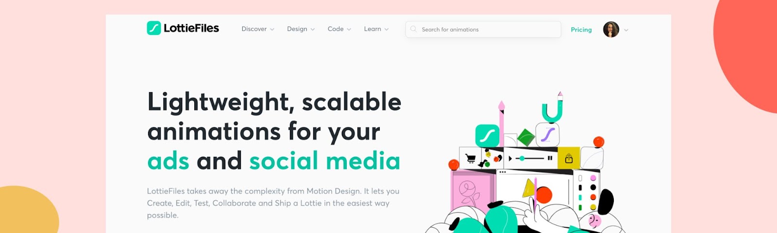
When adding animations to your emails, be aware of accessibility requirements. Include good alt text and don’t put heavy animation that will affect download speeds. You can choose many free lightweight animations (even for commercial projects) from a popular animation platform called LottieFiles. There you can find all types of animations for most product marketing use cases.
Animations within product usage
Onboarding animations
PMs and PMMs dream for users to instantly understand product value and be able to reach this value within the product ASAP. Then become loyal paid customers. In other words, they would just get to the ‘AHA moment’ immediately.
In this scenario, all of them would be extremely likely to recommend your product to friends, driving your NPS up. In reality, onboarding often doesn’t perform well. According to recent research, 80% of users delete their apps because they didn’t understand how to use them.
That’s why it’s important to design onboarding that educates users on getting value from your product and reduces friction, all while being fast and contextual. An interesting example of animated onboarding would be Figma’s getting started flow, which is explained in detail at GoodUX by Appcues.
Figma is a cloud-based design tool with many design, prototyping, feedback, and collaboration features. Their product is complex and comprehensive. So a guided product tour with features-explanatory animations hugely increases the chances of better Figma adoption. It’s contextual, engaging, visually simple to understand, and follows Figma’s brand voice.
Awards animations
If you are familiar with the Hooked model or the “Emotion, Logic, Motivation, and Reward” framework, you might know that reward is an important part of forming users' habits.
The reward comes after completing the key action in your product: sending an email or completing one of the Product Marketing Alliance programs. The reward is also a part of the gamification process. It is used in many learning apps, like Duolingo or Memrise, when you see animated congratulations or points added when you complete the lesson.
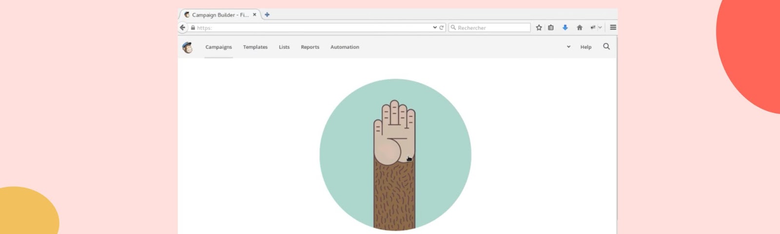
Animations are widely used to provide virtual rewards. For example, Mailchimp uses an animated high-five after its users send emails, rewarding them with a virtual ‘great job’. While it looks like a simple UI element, such animations work at the user psychology level. It eventually leads to forming users’ habits and growing product usage and retention.
Gamification animations
Game-like experiences include streaks, badges, gradings and levels, points and virtual coins, progress bars, and members’ rating dashboards. Many of those UI elements are usually live, and animated and have some motion transitions, which makes them more playful and fun to engage with. Gamification is about triggering humans’ emotions and animations can perfectly strengthen this goal.
If you are working as PMM in the learning, wellness, or health apps industry, you should consider using animated gaming experiences when building customer journeys.
As I mentioned before, a deeper understanding of how design can influence users will help you, as PMM, propose solutions to adoption, activation, and retention challenges in your product.
A word to the wise: for all the benefits of implementing gamification and animation in your marketing strategy, too much of it can be harmful. My favorite example is the Malaysian shopping website Shopee, where animations are jumping on you every minute with offers, discounts, coupons, points for every purchase, and dozens of different rewards for every seller.
If a European user wants to buy a cream, they’ll have a confusing experience with much distraction. However, as I didn’t run user research for Asian audiences, I couldn’t fully comment on their user needs.
Errors animations
Animations can provide immediate visual feedback. It’s very important to identify when users get blocked by some mistake or error and help them. Error states are a type of micro-interactions where a user can get alerted of a problem on the screen.
The classic example is an incorrect password animation. The user will see the red password field which will be shaking. It visually explains that it has been input incorrectly and needs re-doing.
Errors are happening during filling the registration flow where many fields need to be filled (like inputting the wrong email address). They also appear when your product fails to do what’s requested, or your product can not understand the input from the user.
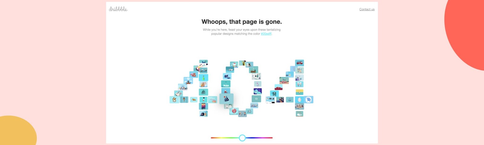
Think of uploading the wrong file format and your app can not process it. You can speak with your support team and receive many more interesting stories of users' errors. One more example I'd love to mention is the 404 error state when animations are used very often.
If you own some funnel conversions, like a conversion from the website visitor to the registered users, you really want to be sure that users are not blocked.
So it’s your job as a product marketer to audit customer journeys, define possible errors, and escalate those to the product and design teams. And now you know that your design team can add functional animations to help users overcome errors.
Animations within sales enablement
Case study animations
A good case study contains a lot of meaningful information that sings the benefits you bring to customers. All are achieved with minimal fuss so they can be consumed quickly.
That is precisely why animation is a perfect fit for case studies. A good case study will state the problem for the client, show the way your product helped solve that problem, and then the results at the end.
They usually come at the decision stage of the customer journey and are shared among the team to foster the decision. Case studies add more social trust to your product and reinforce your marketing promises. That being said, having a visual representation of customers results in an eye-catching manner is very important. Animations can empower the customer story you are telling in your case study.
Sales deck and emails
The use of animation within some of the many sales enablement materials is a nice way of adding personality to the sales pitch. For example, within a sales presentation, you might include a little animation on a slide to emphasize different things you are talking about (it’s easy to do).
You can also help the sales team with outreach emails, empowered with various animations, and see how it impacts reply rates. Ultimately it's about standing out and getting prospects' attention in a noisy digital world.
Animations in sales enablement helps re-emphasize the unique selling points that a company has. However, it might not work for all industries, especially for those where a more conservative style is the norm.
Animations within content
Customer education animations
Animations help to break down complex themes and ideas. This makes them an ideal tool for helping to educate customers about product capabilities. Due to animation's ability to engage a user, it matches well with delivering a subject over a longer period while keeping the user involved.
Educational animations can be used in product updates, product guides, support articles, and documentation for technical products (APIs, SDKs). On top of animations, educational videos are another go-to option for educational content. Animations are faster to prepare, compared to educational videos and they serve a supporting function to the existing text content.
Don’t forget that animations in the educational content should be meaningful and functional, ideally re-used from other design assets. Otherwise, your design team can run away from requests to prepare animation for every education piece your PMM team is releasing.
Internal PMM documentation
As PMMs, we prepared a lot of documentation: GTM playbooks, PMM processes, launch briefs, competitive intelligence reports, results of user and competitor research, key user personas, and positioning docs.
All those documents can be easier to digest with playful animations inside them. I’m the ‘documentation person’ who writes a lot of text - you probably noticed this from the size of this article! I find it’s very useful for my documents to have some animated elements added here and there to keep my readers engaged.
Top tip: Don’t ignore animations in your PMM toolbox
The best animations don’t only show capabilities, they tell stories. They convey the key messages in a minimum amount of time, removing fluff. At the same time, motion is a vital part of the expected user experience.
So it’s not a question of incorporating motion design in your products. It’s a question of how product marketing can use animations to deliver better jobs for a company and the end users.
And if you’re a hands-on PMM who wants to play with animations right away, you can search for any animation you like, edit and add it to something like your weekly slide on the All Hands presentation.
Just remember that motion, as any other design deliverable should come at the right time, in the right place, and with the right story.
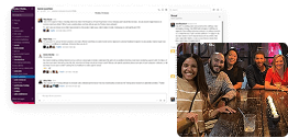
Learn more about Lisa
Make sure to catch up on Lisa's experience going from Computer Science Master to Head of Product Marketing in a blog series dedicated to spotlighting incredible Ukrainian talent within the product marketing community. 👇
 Charley Gale


Product marketing insider
Thank you for subscribing
Level up your product marketing career & network with product marketing experts.
An email has been successfully sent to confirm your subscription.
 Follow us on LinkedIn


.svg)
Start the conversation
Become a member of Product Marketing Alliance to start commenting.
Sign up now